In the early days of football it was rare for clubs to wear crests on their shirts. Usually the only times they were worn were in cup finals. In United’s first FA Cup final, they wore an embroidered Lancashire red rose on their jerseys:

It was almost 40 years until United appeared at another final and this time they wore the Manchester coat of arms:

The same crest was worn in the 1957 Cup final against Aston Villa:

In the wake of the Munich disater in 1958, United managed to reach the final again and wore this crest on their jerseys (the first time they had worn their red home shirts in a final):

Contrary to popular belief, it does not depict a phoenix rising from the ashes, but is a short-lived badge featured in a new Manchester coat of arms introduced several months earlier. The golden bird is actually an
eagle and is the same that is featured on City’s current crest. For more information, see this link
By the time of the 1963 cup final, United had reverted back to the old Manchester coat of arms:

It was used again in the 1968 European Cup Final:

This version of the club crest appeared on official club documents in the 1960s:

The three bands are often said to represent the city’s three rivers, the Medlock, the Irwell and the Irk. Actually, they are the ancient arms of the Grelley family (the first Barons of Manchester) and should be coloured gold (referered to as “or” in heraldry) on red (“gules”). Above that is a ship in full sail, a symbol of trade and enterprise (not of the ship canal as often thought).
Interestingly, this badge features roses instead of footballs. Presumably they are representitive of the red roses of Lancashire (which Manchester was still a part of at the time), but for some reason they have not been coloured like other parts have and could therefore be confused with Yorkshire’s white roses.
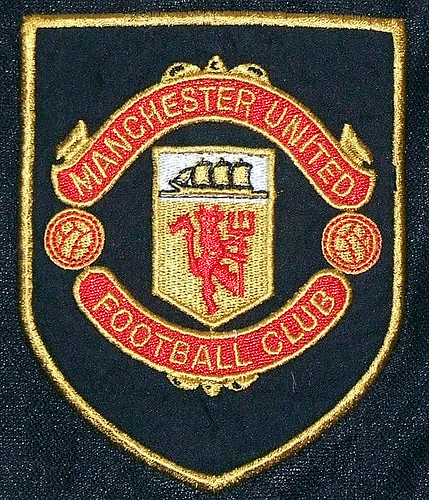
It was redesigned in 1970 but it was not until the following year that it was worn on the players shirts:


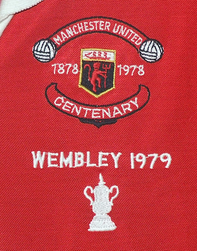
When Admiral took over from Umbro as kit suppliers they changed the colour of the ship to red but otherwise it stayed basically the same (although it appeared in a variety of colours on away shirts) until the club’s centenary season 1978/79:

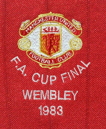
The following season it reverted back to the earlier version and changed slightly when adidas took over the kit contract from Admiral in 1980:

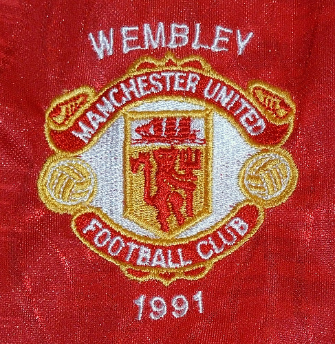
In 1984, adidas added a pair of three-stripe boots to the top ribbon of the crest – a feature that remained until 1992:

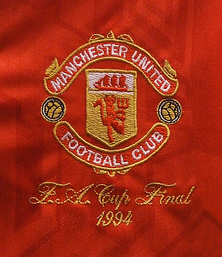
At the start of the Premier League era, United’s contract with adidas ended and Umbro took over. The crest was again redesigned – the boots were removed along with the solid white background:

In 1993, again there was a minor change – the white lettering was replaced by gold, as was the red ship:


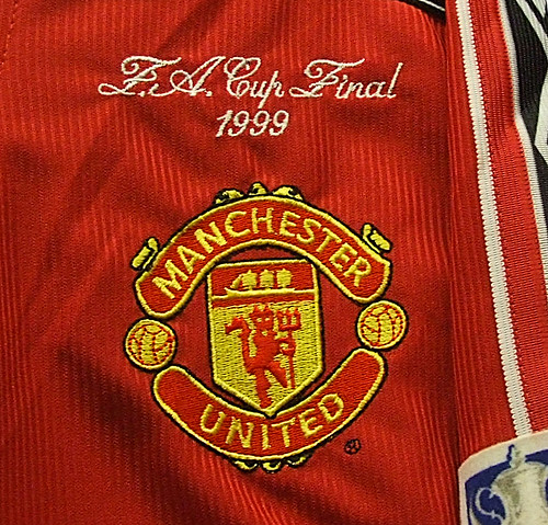
The major and most controversial change to the crest came in 1998 (although the new design was registered a year earlier). The words “football club” were removed and the colours were altered. The badge was also squashed horizontally and a black outline was added:


This information was compiled by Tim from www.unitedkits.com. For more information check United Kits or Tim’s Flickr account.
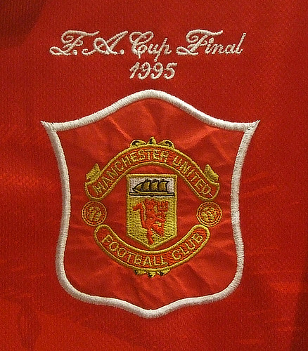
When Admiral took over from Umbro as kit suppliers they changed the colour of the ship to red but otherwise it stayed basically the same (although it appeared in a variety of colours on away shirts) until the club’s centenary season 1978/79:
The following season it reverted back to the earlier version and changed slightly when adidas took over the kit contract from Admiral in 1980:
In 1984, adidas added a pair of three-stripe boots to the top ribbon of the crest – a feature that remained until 1992:
At the start of the Premier League era, United’s contract with adidas ended and Umbro took over. The crest was again redesigned – the boots were removed along with the solid white background:
In 1993, again there was a minor change – the white lettering was replaced by gold, as was the red ship:
The major and most controversial change to the crest came in 1998 (although the new design was registered a year earlier). The words “football club” were removed and the colours were altered. The badge was also squashed horizontally and a black outline was added: